Monday, 22 April 2013

Friday, 15 March 2013
Evaluation of 'Abandoned' Title sequence
The title sequence for Abandoned was constructed after my
group and I had created a film idea. The aim of our title sequence was to
create and eerie atmosphere four our audience. The title sequence starts with a
tracking shot of a stream with the sound of water loudly trickling, this then
cuts to images of children on the wall. The photos previously shown on the wall
are later seen violently burning, while the sound of distorted, ghostly children
are singing a nursery rhyme is playing.
The title of our film is the last title to be shown; it fades in over
the top of a creepy dolls house that is set on fire. We wanted to make sure
that the whole title sequence would convey to our audience that the film would
be a horror, whist the ghostly singing also shows the sub-genre of our film
which is a supernatural horror. We chose this as our sub-genre as we wanted our
film to only suggest how people were killed and not show any gore and
supernatural films tend to lack gore. The lack of gore also meant that we could
lower our target audience age in order to attract a wider audience.
When we were researching, we found that teenagers were
most commonly the targeted audience for horror films, so we took in this
information and applied it to our horror film. Our primary audience for ‘’Abandoned’’
would be females due to the psychological elements in the film, however it
could still entice a male audience as it is still a horror film. Our primary audience
is females aged 12-18 whilst our secondary audience are aged from 18-25 as this
would cover students and people who could relate to the film as the stars of
the film are predominantly children who live in an orphanage. We decided to
have ‘’Abandoned’’ as a 12 so we did not restrict our audience, we also
researched into ‘The Woman In Black’ whose certificate was also a 12, this film
did very well in the cinema so we felt that ‘’Abandoned’’ could follow in the
films footsteps.
After conducting a survey on our target audience, we found that the
psychographics would be people who enjoy reading, listening to music and for
fans of horror.
We decided that Hammer Films would be the best institute to
distribute ‘’Abandoned’’ as they are known for releasing successful horror
films each with different sub-genres. Also, we frequently likened our film to ‘The
Woman In Black’ which was distributed by Hammer Films. Both ‘Abandoned’ and ‘’The
Woman In Black’’ have a supernatural element, so Hammer Films would be the best
and most likely institution to distribute ‘Abandoned.
Before we started to even film for our title sequence we
watched many title sequences for different genre’s in order for us to realise
how important micro elements are. We found that the micro elements are the best
way to communicate the genre of our film. Two of the title sequences that we analysed
were for the films ‘Zombieland’ and ‘The Ward’ both of these films are horror
genres. From viewing the title sequences we were able to pick out that a horror
title sequence should have dark, dull colours and also uses some form of eerie
music track. 
We felt that the best way to communicate the genre of our film to
our audience would be through the use of the mise-en-scene and we decided that
our title sequence should be set in the woods as this is a common setting for a
horror film due to the dull lighting and absence of other people. We also did
not want to make out title sequence narrative based as we felt that small hints
to our film would be more effective in creating a buzz for our audience.
We decided to use many close ups in our title sequence as the close ups show
the main focus’ of our film. The majority of close ups used are of children’s
pictures, these are firstly shown stuck on the wall and then are later shown burning,
this enables our audience to realise the film includes mainly children; the
burning also signifies the children’s loss of innocence.


We also recorded a
nursery rhyme in which we distorted in final cut pro, not only does the nursery
rhyme work as they are typically associated with children, but the distortion
on the song also makes the audience feel uncomfortable, which is another typical
element for horror. We made sure that all of our sequence had dull colours by
editing the light in the woods in order to create fear for our audience which
is also commonly used for horror. We wanted to make sure that the whole of our
title sequence demonstrated connotations of horror, we successfully did this by
using eerie music, dark colours and the burning of children’s photos and dolls
house. At first we had a little trouble with the font and colour of our typography,
but we overcame this after watching the title sequence foe se7en, we liked the
colour and decided to apply it to our sequence.
Only one social group has been represented in our title sequence, that being children. ‘Abandoned’ shows that children are innocent at first through the use of a tracking shot showing their happy pictures however it also shows that children can easily lose their innocence. This is shown through the use of a close up of the same photo’s burning. We chose to use children as our target audience can easily relate to them as well as finding the children to be creepy.
I think that we have successfully met our target audience
as the feedback we received from our class was positive, they also agreed that
our target audience was the correct choice. Also the people who gave us our
feedback fell into the primary audience range of 12-18. They also felt that our
music was successful as it created an eerie atmosphere. They also pointed out
the fact that we didn’t use a tri-pod for filming so some parts were shaky, to
overcome this, if we were to re-do the task, we would make sure that a tri-pod
was used, however due to the genre being horror, the shakiness may work in our
favour as it can disorientate our audience.
We used Final Cut Pro to edit the sequence together, I used
this to my advantage as I already had a fairly good understanding on how to use
the software so I felt comfortable using it. We used that to out advantage and
were able to further explore different effects to use. I learnt many new skills
which included the uses for different effects, colour corrector, overlapping
videos and how to change how the audio sounded. We used each of these in order
to make our title sequence become more eerie. We also used a video camera that
had a separate screen so we were able to easily see what we had filmed and we
could re shoot straight away if we noticed a problem. From this experience I have
also realised how important it is to use a tri-pod when filming, a tri-pod
makes sure that all of the clips are straight and steady, another lesson i
learnt would be to make sure there are no un-needed objects in a shot as we had
filmed some clips in the woods and after looking at them on a mac computer, we
realised that there was a Morrison’s plastic bag in the shot, so all of these shots
were rendered useless.
Overall, I think that the title sequence for ‘Abandoned’
was very successful due to our research and editing. As our sequence is not
jumpy and edited together smoothly whilst our research gave the whole group a
good idea as to what needed to be included to meet our target audience as well
as communicating what genre ‘Abandoned’ is. We were also able to successfully
use micro elements in order to create fear and an eerie atmosphere for our
audience. I feel that the production was a weaker point as our clips were not
always steady, however, I have gained from this as I will make sure not to make
the same mistake again.
Monday, 28 January 2013
Post-production
The past previous times in which we had dedicated to editing, the Macs have either not been working or were freezing too much to be able to edit.
Although, we have been able to look at and decide on a font which will be used for the titles. We looked on the website dafont in order to find our font as there is a wide variety of many different fonts.
The font we decided on is called 'Nervous' we chose this as we felt that it would disorientate the audience and convey that the film is a horror. We also decided that we would make the font red, as the colour has connotations of blood and danger, which could foreshadow what will happen in the film.

This is the font that we decided on, we liked how it had a 'shaking' effect.
Night bird and Feast of Flesh were two other of our possible font choices, but after putting all three fonts together, we decided that these two look like they would fit a slasher film rater than a psychological horror. We felt that the two would not fit our titles and instead may add a comedic element to it.
.jpg)
.jpg)
Although, we have been able to look at and decide on a font which will be used for the titles. We looked on the website dafont in order to find our font as there is a wide variety of many different fonts.
The font we decided on is called 'Nervous' we chose this as we felt that it would disorientate the audience and convey that the film is a horror. We also decided that we would make the font red, as the colour has connotations of blood and danger, which could foreshadow what will happen in the film.

This is the font that we decided on, we liked how it had a 'shaking' effect.
Night bird and Feast of Flesh were two other of our possible font choices, but after putting all three fonts together, we decided that these two look like they would fit a slasher film rater than a psychological horror. We felt that the two would not fit our titles and instead may add a comedic element to it.
.jpg)
.jpg)
Saturday, 26 January 2013
Post-production
We are still experiencing technical difficulties with Final Cut Pro, it is not allowing us to download the clips that we need for the sequence, also the Mac's keep freezing, leaving us unable to continue with the work. However, during the time when the Mac's are not working, we have realised that, although our storyboards were helpful in filming, for editing, we feel that some clips need to be rearranged or changed.
We have also chosen a font called nervous and we have used the colour red to connote blood, danger and fire.
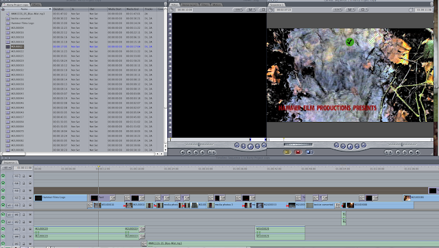
We have also chosen a font called nervous and we have used the colour red to connote blood, danger and fire.
Friday, 25 January 2013
Post production
We are still in the process of editing our sequence together but there are currently technical issues with final cut pro and we are also unable to convert our clips.
Although we have decided that our storyboard did not convey the eerie atmosphere that we wanted, so we are using it as a basic guideline and are editing our clip together to how we feel would be the most effective.
Although we have decided that our storyboard did not convey the eerie atmosphere that we wanted, so we are using it as a basic guideline and are editing our clip together to how we feel would be the most effective.
Post-production
We are currently starting to edit our title sequence and at this stage we are also deciding on what music to use throughout the majority of the titles. We have listened to many different typical horror tracks and have pick out four that are possibilities. Also, as our film is based in an orphange, we have decided to use children singing a nursery rhyme, This was tricky to decide on one as many horror films have previously used nursery rhymes.
These are the possible choices, and at this point, each member of the group prefer the first track as we feel it creates the most tension and creates an eerie atmosphere.
These are the possible choices, and at this point, each member of the group prefer the first track as we feel it creates the most tension and creates an eerie atmosphere.
Day of Shooting for 'ABANDONED'
As planned, set out to film on the 30th December, in a muddy and cold woods.
Due to the group being familiar with the woods we were able to have a rough idea in the area in which we would shoot the river scenes. We knew that, depending on the weather, there may have been little-or no water to film but luckily, it had rained several days before we were due to shoot and therefore there was a substantial amount of water. Although we thought that there would be this water, we still brought along several bottles of water in case it needed enhancing, thankfully we didn't need to do this and instead we used the water to clean our muddy shoes after the day's filming.
We managed to roughly follow our storyboard and film many different shots of the river, we filmed more shots than we knew we needed as we wanted to prevent the chance of needing to re-shoot, this therefore would leave us enough time to edit.
After filming in the woods, we headed back to our second location on nightfall, to film the burning of the doll's house and photo's. We encountered problems with the filming of this as it was windy outside and the doll's house refused to light but after a sprinkling of white spirit, the house lit and gave us the result we wanted.
Overall, it was a successful day of filming.


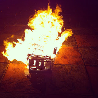


Due to the group being familiar with the woods we were able to have a rough idea in the area in which we would shoot the river scenes. We knew that, depending on the weather, there may have been little-or no water to film but luckily, it had rained several days before we were due to shoot and therefore there was a substantial amount of water. Although we thought that there would be this water, we still brought along several bottles of water in case it needed enhancing, thankfully we didn't need to do this and instead we used the water to clean our muddy shoes after the day's filming.
We managed to roughly follow our storyboard and film many different shots of the river, we filmed more shots than we knew we needed as we wanted to prevent the chance of needing to re-shoot, this therefore would leave us enough time to edit.
After filming in the woods, we headed back to our second location on nightfall, to film the burning of the doll's house and photo's. We encountered problems with the filming of this as it was windy outside and the doll's house refused to light but after a sprinkling of white spirit, the house lit and gave us the result we wanted.
Overall, it was a successful day of filming.


Monday, 14 January 2013
Title Credits Research
Order of the credits
•Production
Company presents
•"Title"
•Lead
Cast
•Supporting
Cast
•Casting
Director
•Music
Composer
•Costume
Designer
•Associate
Producers
•Editors
•Production
Designer
•Director
of Photography
•Producer
•Writers
•Director
We also think that we may use the title at the end of the sequence as this is not uncommon. Hammer films is our chosen production company as they mainly create horror films, therefore this company would be most suited.
Building the dolls house
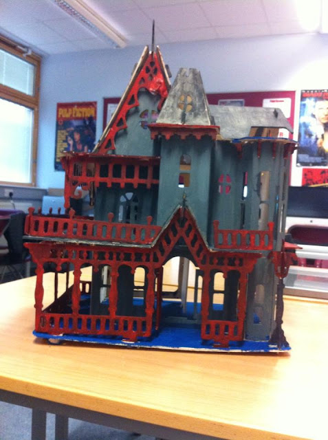
Building the dolls house took us around Five lessons to complete, however this was okay as we had anticipated that it would take a while to complete. We wanted to make sure that the dolls house would be complete by the time we broke up for the December half term as this was when we decided we wanted to shoot for our title sequence.
We have currently found a few audio tracks that we like and are currently debating what one would fit best with our title sequence, so we will wait until we have shot and edited footage before we think of the music any further.
We are also looking at font's to use, and so far we have found none but we have decided to have the font red as red is a typical colour in horror.
Wednesday, 5 December 2012


Monday, 3 December 2012
Journal: Abandoned Title Sequence

In preparation for the filming of our title sequence we had to buy a dolls house, this was the cheapest and nicest looking house. We didn't want to spend too much money on it as we are going to burn it.
Blog feedback.
I agree with the feedback that i have received and i will improve the posts that need to be improved.
For the zombieland sequence i will add to it to make it longer. i also understand that there is a comedic element present in the titles,but i have not included that so i will re watch the sequence and add in all of the points that i have missed.
I will also add to my analysis of 'The ward' as it is too short. I had previously finished it but i lost all of my analysis. I will also complete another title sequence.
With the comments on my groups fight sequence with foley sound i agree with the comments made, although one comment states that we shouldn't have removed all of our sound, but as a group we were under the impression that this is what we had to do.
I will also add to my evaluations and start linking posts to the title sequence that we are creating.
The Ward- Title Sequence analyasis
As the title sequence begins, it pans out through what looks like a hospital ward, or possibly a mental hospital which is suggested through the use of one single window in the background. This one window is also barred up which could cause the audience to think that whoever is in this place, is not allowed to leave for some unknown reason. There are lights in the ward, although only one is lit very dimly, this could also suggest that not only are the occupants of the building not allowed to leave, but could possibly be made to kept hidden. The only lighting used in this sequence is the flashes of lightening coming through the barred window.

As the camera is panning out from one end of the corridor, someone begins to whistle, although we can not see anyone that could be making this noise. The whistling and the sound of thunder and lightening connote that his film will be a horror as the whistling makes the long dark corridor look very creepy, also the audience feel as if they are walking backwards away from the window which creates tension and fear as the audience do not know what could be behind them which also adds to the fact the film is probably of a horror genre. As the camera reaches the other end of the corridor, the title of the film comes into the middle of the screen and changes colour,from black to blue,as a flash of lightening appears. As the lightening stops, the titles appear in white font on a black background this could suggest that something is lurking in the dark as the white is emerging from the dark.The titles then flash and disappear.
A woman's voice then starts, she sings no words but her voice is high pitched and therefore can creep the audience out, especially as it is accompanying an image of a man being tied upside down by their feet, the photo's look old and could be some form of medical practice. Each image that is shown changes at a flash of lightening, this foreshadows that the photo's and the ward could possibly linked, although it is obvious that they are both set in different time periods due to the working lights in the ward and the oldness of the images.
 On an image of a woman tied up by her hands, the first cast members name fades in 'Amber Heard'. This could suggest that this is a possible future of her character.
As her name disappears the photo cracks and it becomes clear that it is a mirror shattering. Mirrors breaking typically symbolises that a person will have seven years bad luck which could also show the audience that this is a horror film. The shattering of the glass could also foreshadow a characters trait, the shattering glass could suggest that someone will have a split personality that cant be fixed as the mirror breaks into several different small pieces.The colour of the font is all in white, the colour of white connotes innocence and purity, this could suggest that, if someone has a split personality, they may not know that anything is wrong.
Once the mirror cracked, the music becomes louder and the woman's voice more prominent, this causes the audience to feel tense, as the voice is so high that it could send shivers down your spine. Also the fact that a woman is singing could suggest that the film is centered around women.
One of the photo's that cracks is of a woman praying, with some form of device attached to her head, this could connote that there is some religious element to the film. Also this shows that the woman knows her fate, and that she could possibly die at the hands of this device
During the sequence, the glass shards split even more and start to become even smaller than before and shatter toward the screen rather than away from it. As this is happening it could cause the audience to think that, if the pieces are linked to a person, then this person has gone beyond the point of being 'fixed' and that there is maybe no turning back for this person. As the glass becomes more severe, the pictures start to show people being lobotomized. Lobotomy's were used before the brain was understood to 'cure' people of mental illness'. These images then can back up any enigmas previously created for the audience about someone being mental or having a split personality. This could also foreshadow the future of the person that has this mental illness.
At one point, the glass splits in three different places. This could cause the audience to think that maybe there are three different sides to this person.

As the camera is panning out from one end of the corridor, someone begins to whistle, although we can not see anyone that could be making this noise. The whistling and the sound of thunder and lightening connote that his film will be a horror as the whistling makes the long dark corridor look very creepy, also the audience feel as if they are walking backwards away from the window which creates tension and fear as the audience do not know what could be behind them which also adds to the fact the film is probably of a horror genre. As the camera reaches the other end of the corridor, the title of the film comes into the middle of the screen and changes colour,from black to blue,as a flash of lightening appears. As the lightening stops, the titles appear in white font on a black background this could suggest that something is lurking in the dark as the white is emerging from the dark.The titles then flash and disappear.
A woman's voice then starts, she sings no words but her voice is high pitched and therefore can creep the audience out, especially as it is accompanying an image of a man being tied upside down by their feet, the photo's look old and could be some form of medical practice. Each image that is shown changes at a flash of lightening, this foreshadows that the photo's and the ward could possibly linked, although it is obvious that they are both set in different time periods due to the working lights in the ward and the oldness of the images.

As her name disappears the photo cracks and it becomes clear that it is a mirror shattering. Mirrors breaking typically symbolises that a person will have seven years bad luck which could also show the audience that this is a horror film. The shattering of the glass could also foreshadow a characters trait, the shattering glass could suggest that someone will have a split personality that cant be fixed as the mirror breaks into several different small pieces.The colour of the font is all in white, the colour of white connotes innocence and purity, this could suggest that, if someone has a split personality, they may not know that anything is wrong.
Once the mirror cracked, the music becomes louder and the woman's voice more prominent, this causes the audience to feel tense, as the voice is so high that it could send shivers down your spine. Also the fact that a woman is singing could suggest that the film is centered around women.
One of the photo's that cracks is of a woman praying, with some form of device attached to her head, this could connote that there is some religious element to the film. Also this shows that the woman knows her fate, and that she could possibly die at the hands of this device
During the sequence, the glass shards split even more and start to become even smaller than before and shatter toward the screen rather than away from it. As this is happening it could cause the audience to think that, if the pieces are linked to a person, then this person has gone beyond the point of being 'fixed' and that there is maybe no turning back for this person. As the glass becomes more severe, the pictures start to show people being lobotomized. Lobotomy's were used before the brain was understood to 'cure' people of mental illness'. These images then can back up any enigmas previously created for the audience about someone being mental or having a split personality. This could also foreshadow the future of the person that has this mental illness.

Also, throughout the sequence there are more images of women than men, in one image it shows a woman sitting on a dirtied floor, with her head down in her legs. This could show that the women in the ward may not be being treated correctly, and could also be quite frightened.

Thursday, 29 November 2012
ZombieLand title sequence analysis
The title sequence for Zombieland shows several different zombies chasing down normal people. The whole of this sequence has rock music playing, this connotes anarchy and rebellion. The font that is used are in bold red letters. The red letters could connote that the genre of the film is horror as red is usually associated with danger,blood and gore.

Another zombie is in her wedding dress, this could foreshadow that the zombie formation could happen at any time, and that these zombies would have been normal people living normal lives, which also shows that their may be some virus that is effecting them in this way.


We then see a mid shot of a man who is has blood pouring from his mouth,showing that this film will be violent and gory, this is backed up through the whole title sequence as some form of blood or attack is always preset. This also connotes that the film is a horror genre as the 'man' looks like a zombie and blood is also a typical convention of horror films.
There are several shots throughout the sequence that show ordinary workers running from the zombies.One shot is of a woman running whilst spilling her drink in the air. Her expression shows sheer horror as she is clearly fearing for her life as a potentially bloodthirsty zombie is trying to attack her.
One man that is being chased is holding a briefcase, this shows the audience that the zombies do not care for the people that they are going after, and that they are just after anyone they can see.Another zombie is in her wedding dress, this could foreshadow that the zombie formation could happen at any time, and that these zombies would have been normal people living normal lives, which also shows that their may be some virus that is effecting them in this way.
Although there are clear links to the horror genre in this title
sequence there are also comedic elements as well as several binary oppositions.
One shot its shown of a zombie stripper chasing after a well
dressed

business man, the fact that the woman is almost naked add to
the comedy of this sequence. Also, usually it's men that are after strippers,
yet this time it has been flipped around. This could also show that the women
in this film may possibly be the stronger gender as several zombie women are
shown throughout the sequence.
One man is holding a sign reading 'The end is near' this could foreshadow that the end is near due to the zombies and that the zombie apocalypse may have possibly been predicted to end the world.
The whole of the sequence is in slow motion, this could be to show the typical stereotype of a zombie, that they are slow and can be out run. Although the fact that both the zombies and humans are in the same slow shot could foreshadow that the humans will not be able to escape the zombies and they could possibly be at the same speed.
There are also shots of Zombies attacking policemen and firemen.This shows that the zombies have no care for the people that they are attacking and it especially shows that they do not show and respect for authoritative figures.
At the end of the title sequence there is a shot of a man with a machine gun. This foreshadows that the uninfected people may take a stand and attempt to rid everywhere of the zombies in order for them to be able to survive.
Abandoned Title sequence ideas
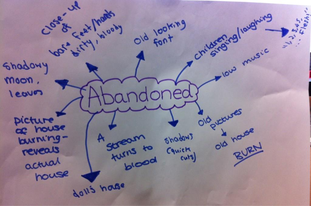
After we had come up with an idea for a film we had to think of ideas for our title sequence. These are our ideas.We particularly like the idea of having children singing a nursery rhyme as it would fit in with our film and help to make it appear creepy.
Other ideas we had include:
For the text we thought we could use old looking creepy font, to show that the film is of the horror genre.
For the sound we thought of:
Other ideas we had include:
- Burning a dolls house
- Burning children's photo's
- Following down a stream
- Showing shadows
- The moon.
For the text we thought we could use old looking creepy font, to show that the film is of the horror genre.
For the sound we thought of:
- Children laughing
- Low eerie music
- Children singing
- Children laughing
- Water running from the stream
Subscribe to:
Posts (Atom)